We're excited to share our brand-new look with you! It's fresh and modern but still holds onto the core values and spirit that our community loves.
With exciting projects on the horizon, including a new website and a retail shop makeover, it was the perfect time for us to review and update Pendleside’s branding to ensure consistency across all areas.
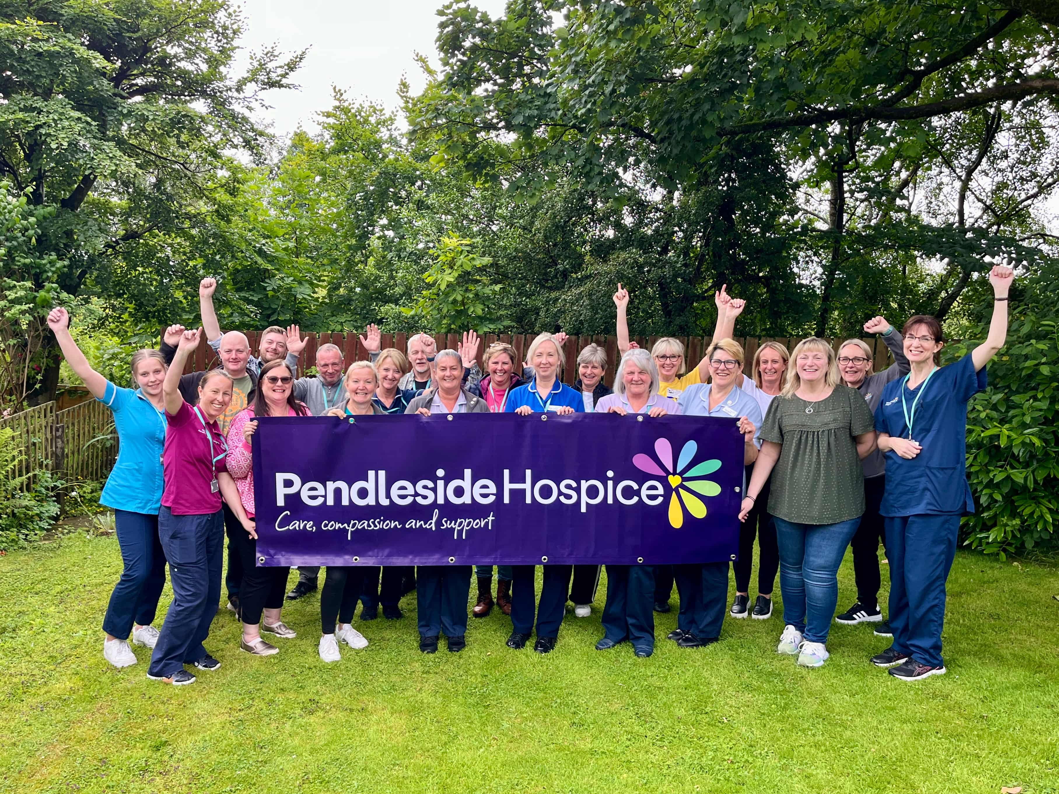
Many elements of our previous logo has stayed the same. The familiar flower emblem was kept to represent the uniqueness of Pendleside’s patients, service users, and their families and carers, with the heart symbol still central to the brand, embodying the Hospice’s care. The values of Care, Compassion and Support are now more prominent, highlighted by a refreshed colour palette that is strong and vibrant. The introduction of a bold, core purple colour revitalises the Hospice’s image, giving it a fresh and energised appearance.
Our team collaborated with local branding and marketing agency Root Fifty-Two, who are also working on our next big project of designing a new, user-friendly website. Given the variety of styles, tones, and colours previously in use, along with our growing range of services and the need to raise awareness about local community support, it became evident that a more unified and cohesive brand image was required.
Michael Barker, Creative Lead at Root Fifty-Two, shared his enthusiasm for the project, “We have been incredibly proud to work alongside Pendleside Hospice. Our aim was to capture Pendleside’s essence and communicate their purpose more effectively to those living in Burnley and Pendle. While the refreshed visuals modernise the look, the initial brand development allowed us to dig deep into their core purpose, identify outdated aspects of the previous brand, and devise language to reshape perceptions of hospice care. We're really excited to see how their new brand identity will make a positive impact within the community.”
The brand refresh has been designed to make it easier for people to connect with Pendleside Hospice and access our services. The updated brand layout makes it simpler to find the right departments and the overall improvements will help us attract and engage new and existing supporters, while making it easier to recruit staff and volunteers.
David Brown, Chairman of Pendleside Hospice, added, "Through this brand refresh, we're ensuring Pendleside remains deeply rooted in our community while evolving with the times to meet the needs of those we care for. It's about honouring our past while embracing a future that enhances accessibility and strengthens our connections.
Having served as Chairman of Pendleside Hospice for nearly two decades, I've witnessed first hand Pendleside's growth and resilience, fuelled by the unwavering support of our community and the dedication of our staff and volunteers. Last year, we celebrated our 35th anniversary, and this brand refresh marks the next milestone in the Hospice's ongoing growth and evolution. As we continue to expand our services and reach, this brand refresh will help us better connect with those who need us and those who support us.”
Kayleigh James, Communications and Marketing Manager at Pendleside Hospice, expresses excitement about the ongoing changes, "The brand refresh marks an incredibly exciting time for Pendleside. Our approach wasn’t about completely overhauling what Pendleside already had in place, but enhancing and building upon the Hospice’s success and reputation.
The rollout of the refreshed brand will be a gradual process, prioritising essential updates first, before gradually introducing changes across signage, uniforms, stationery, marketing materials, online media, and more. Initially, the new logo and branding will be seen on key deliverables planned for the coming months, including a new website.
Our first major project is the revamp of our retail shops. As well as needing essential work such as joinery and decorating, it became clear upon reviewing the signage that a complete overhaul was necessary. Situated prominently along main roads, the fresh new look of our shops will make a significant impact on passersby. This revamp is expected to raise the awareness of our brilliant charity shops and ultimately increase footfall and sales, so keep an eye out for a shop makeover happening near you!"
We look forward to sharing our brand refresh updates with you in the coming months. Raising further awareness of Pendleside, highlighting its services and increasing the Hospice’s overall engagement, all stems to our core mission; to care for more people in Burnley and Pendle who are facing the challenges of advancing long term and life limiting illness or the loss of a loved one.